Welcome to hitchBOT’s Twitter conversations. This page will walk you through three 2D visualizations and then introduce you to the interactive 3D visualizations that are based on the same datasets.
Click here to jump to the interactive 3D visualizations!
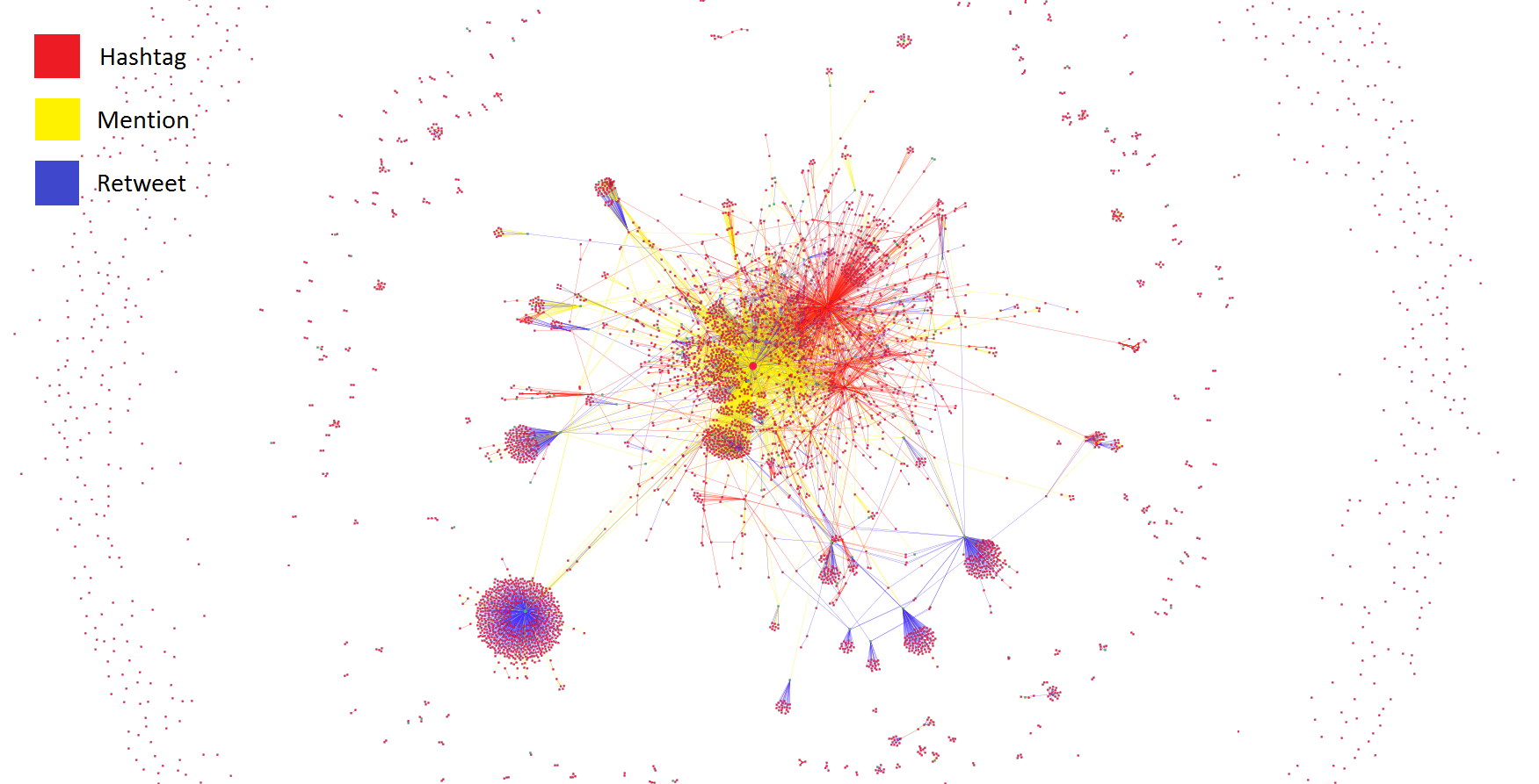
Two datasets were used to create the three visualizations. This first image visualizes hitchBOT’s conversations during its trip across Canada, and the lines between people (edges) are colour coded to differentiate between hashtags, mentions, and retweets.
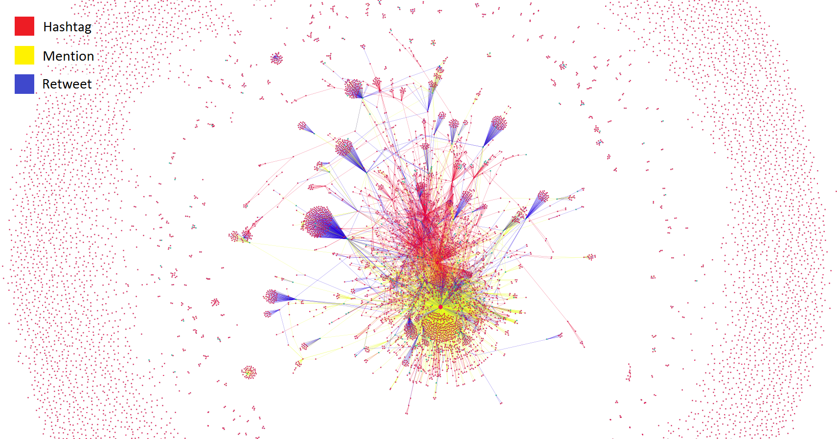
The second and third visualizations are from the time period before hitchBOT embarked on its trip. The edges in this visualization are also colour coded to differentiate between hashtags, mentions, and retweets…
… While this third visualization, also derived from the same Pre-Canada dataset, differentiates edge colours based on whether or not the interaction was with a news source. So if someone retweeted or mentioned a news source the edge between the news source and the person would be green. If someone tweeted to their friend about hitchBOT, that edge would be pink:
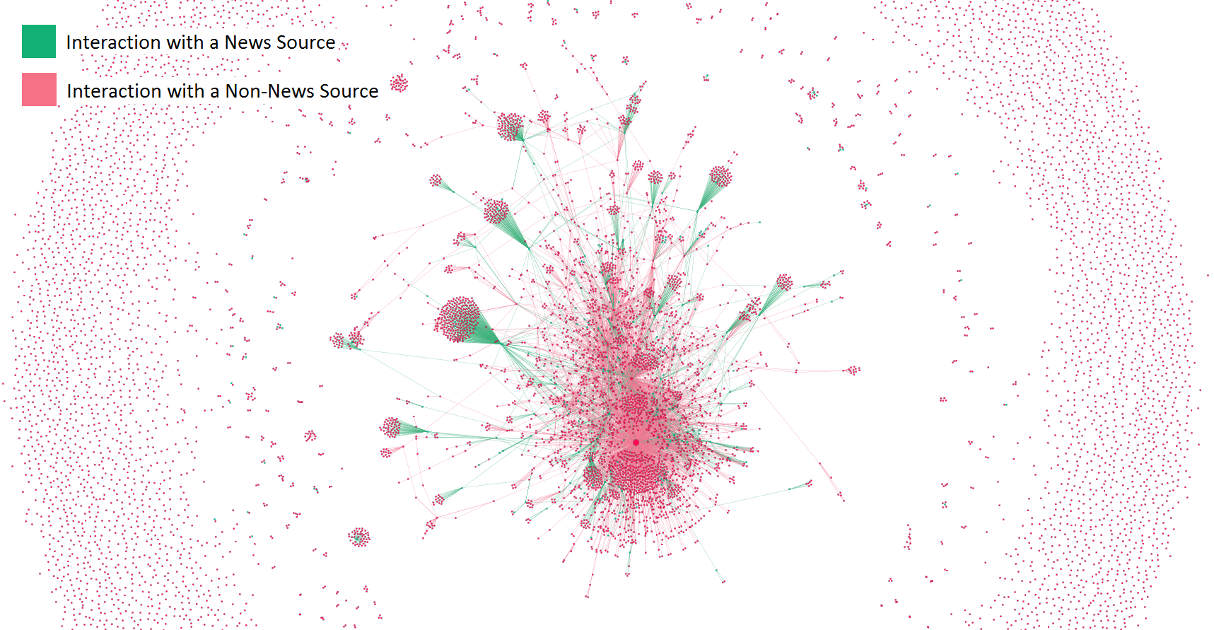
News sources literally framed the conversation.
These 2D visualizations have served as an introduction to their 3D counterparts. Please follow the prompts in the screen below to explore the 3D visualizations.
go here
hitchBOT’s 3D Twitter Conversations
These visualizations are slow to load and may lag when opening.
[unity3d_game game=”WebGL” src=”WebGL” name=” ” fullscreen=0 autorun=0 logo=1 spinner=1]
This visualization was tested on a Chrome browser on a desktop computer.
How to Navigate the Visualizations

There are three datasets to explore:
- hitchBOT Canada: Twitter interactions around hitchBOT during its trip across Canada, colour coded by interaction type (hashtags, mentions, and retweets)
- hitchBOT Pre-Canada Interactions: Twitter interactions around hitchBOT before its trip began, colour coded by interaction type (hashtags, mentions, and retweets)
- hitchBOT Pre-Canada News: Same dataset as “hitchBOT Pre-Canada Interactions”, colour coded to differentiate tweets from news sources or laypeople (news interactions and non-news interactions)
About hitchBOT
hitchBOT is a social robot that hitchhiked across Canada in the summer of 2014. It was launched with an online presence on Facebook, Twitter, Instagram, and a website. The aim was not only for hitchBOT to befriend people who find it on the side of the street but for it to connect with an international community as well.
About the Process
Gephi is a network visualization and analysis tool that allows people to see and understand the communication patterns of a group. The goal of this project was to use Gephi to understand who was in hitchBOT’s “inner circle” of tweeters, and who was in the periphery. Throughout the process, it became obvious that news outlets were paramount to driving hitchBOT forward into new social circles. The graphs are displayed here so the public could see the impact their tweets had on hitchBOT’s Twitter circle.
The 3D visualizations were programmed in C++ within a Unity environment and were based off of the Gephi files.
About the Team
Many of hitchBOT’s family members played a role in developing these visualizations. They were Dr. Frauke Zeller (Ryerson), Dr. David Harris Smith (McMaster), Meaghan Hutchinson (Ryerson), Eduardo Soto (McMaster), and Alexandra Pavliuc (Ryerson).